Logodesign für das Graduiertenkolleg 2638 „Normativität Kritik Wandel“
Das Logo entstand für das 2020 neu gegründete Graduiertenkolleg „Normativität Kritik Wandel“ an der Freien Universität Berlin.
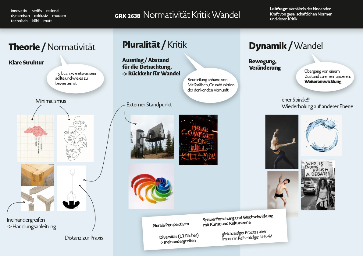
Das Kolleg beschäftigt sich inhaltlich mit dem komplexen Zusammenhang von Normen und deren (Ab)Wandlungen. Die Kritik nimmt in diesem Prozess eine verbindende und zentrale Position ein, da sie den Wandel durch sich selbst in Gang setzt.
Diesen inhaltlichen Fakt überträgt die Gestaltung des Logos visuell. Das Wort Kritk steht in und als Verbindung zwischen den Polen der Normativität und des Wandels. Es bildet eine Brücke oder Verbindung und fügt den Wandlungsprozess zu einem Ganzen zusammen. Wichtig für die Gestaltung war die Gleichwertigkeit aller drei Begriffe, da es im Prozess selbst keine Hervorhebung gibt.
Das Logo bleibt einfarbig in einem farbigen, dunklen Grau, um flexibel und unkompliziert einsetzbar zu sein. Dem Logo zugeordnet sind vier leuchtende und kräftige Farben, die den primären Farbraum bilden.
Da das Kolleg international aufgestellt ist, wurden neben der deutschen auch eine englische Version gestaltet, was aufgrund der Unterschiedlichkeit der Worte eine kleine Herausforderung war.
This logo was concipated for the Research Training Group “Normativity Critique Change”, that was founded at Freie Universität Berlin in 2020.
The RTG deals with the complex relation between standards and their modifications. Critique inherits a central and connecting position inside this process as it gets the change going.
The design of the logo picks up this content-related topic visually. The word critique stands between the two poles of normativity and change, building a connection or bridge and merging the process of standards and changes to a whole. It was important to keep all three terms visually equal as there is no accentuation during the process itself.
The logo comes with a coulored dark grey for flexibility and ease of use. Assigned to the logo are four bright and bold colors that form the primary coulor space.
As the group will act internationally it was necessary to also design an english version, what was kind of challenging due to the big differences between the german and english words.