Logo-Redesign und verschiedene Produkte für das internationale Familienzentrum „aufatmen“
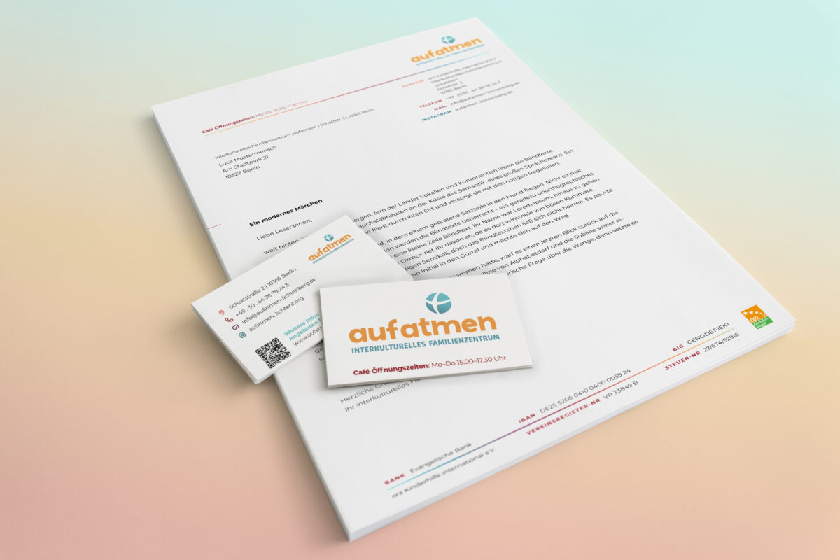
Das interkulturelle Familienzentrum „aufatmen“ beauftragte das grafikbuero mit dem Redesign seines Logos. Bestandteile sind das Signet des Trägervereins ora Kinderhilfe e.V. und zwei Schriftzüge mit Namen und Untertitel. Diese Elemente sollten erhalten bleiben.
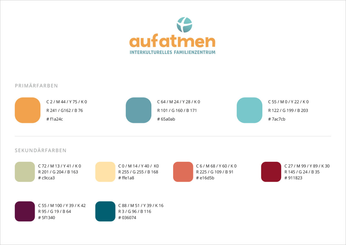
Die Farben des neuen Logos sollten freundlich, warm und leicht sein und zum Rot und Blau von ora Kinderhilfe passen.
Das gewählte dunkle Gelb und gedeckte bis helle Türkis schaffen einerseits eine warme, geborgenen Basis und gleichzeitig eine gewisse Weite, die ein Aufatmen ermöglicht.
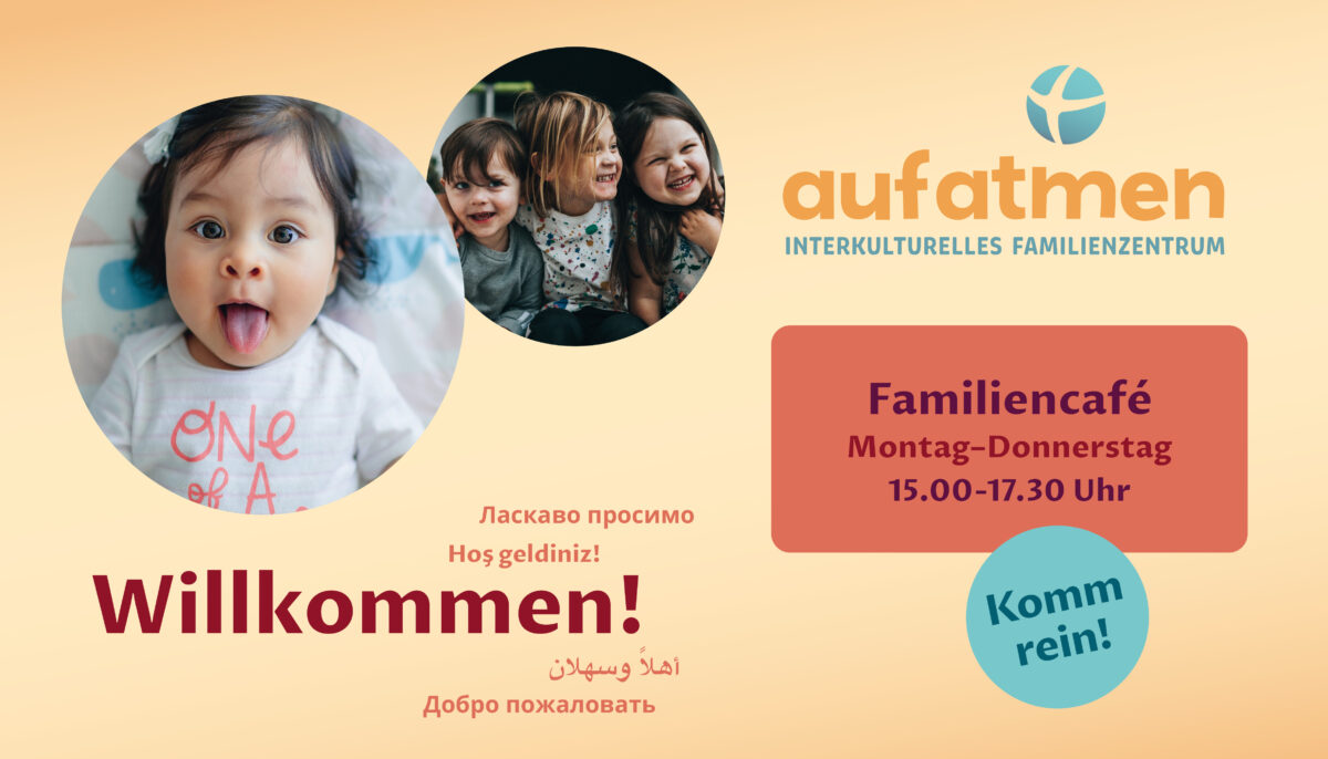
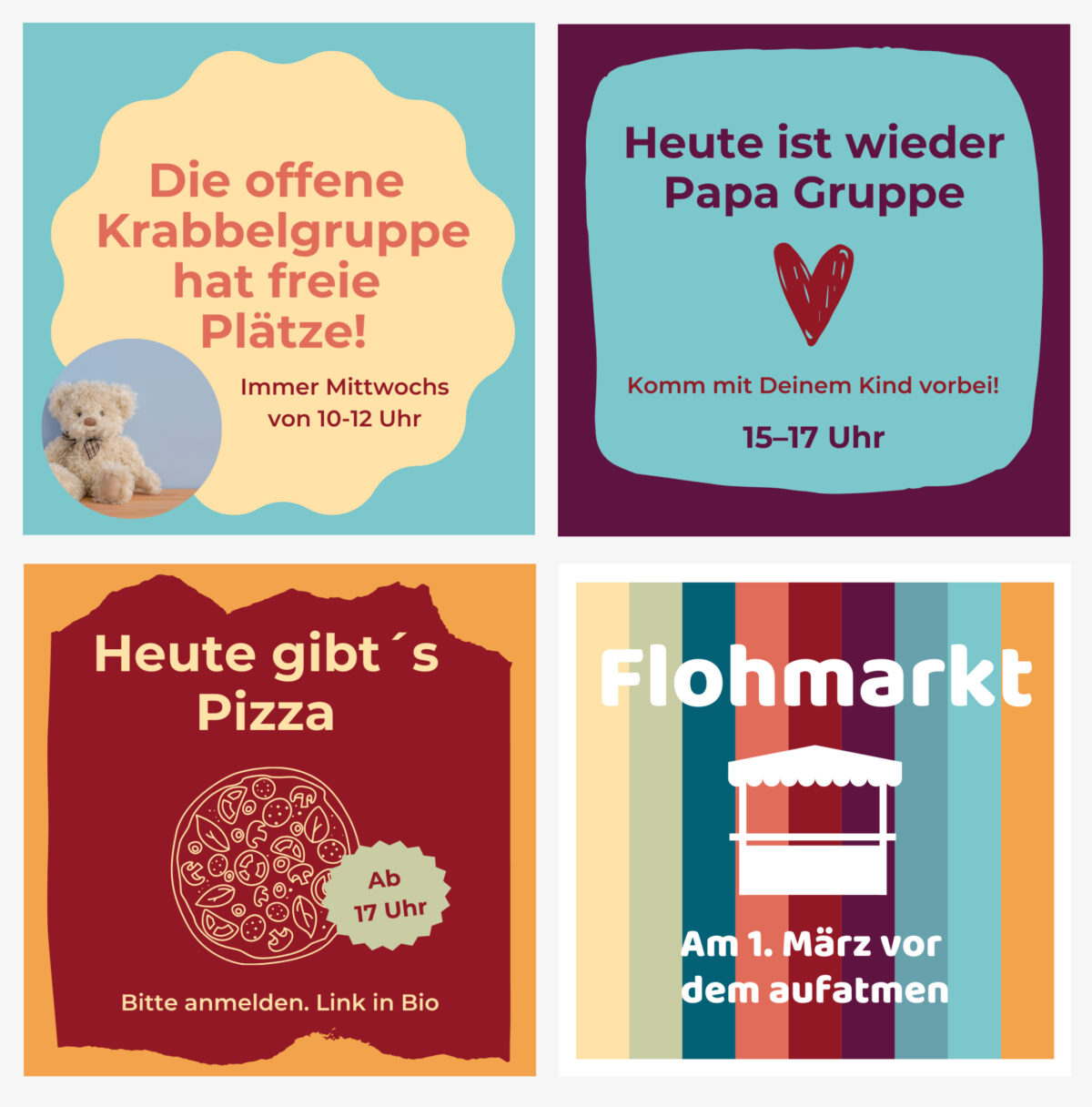
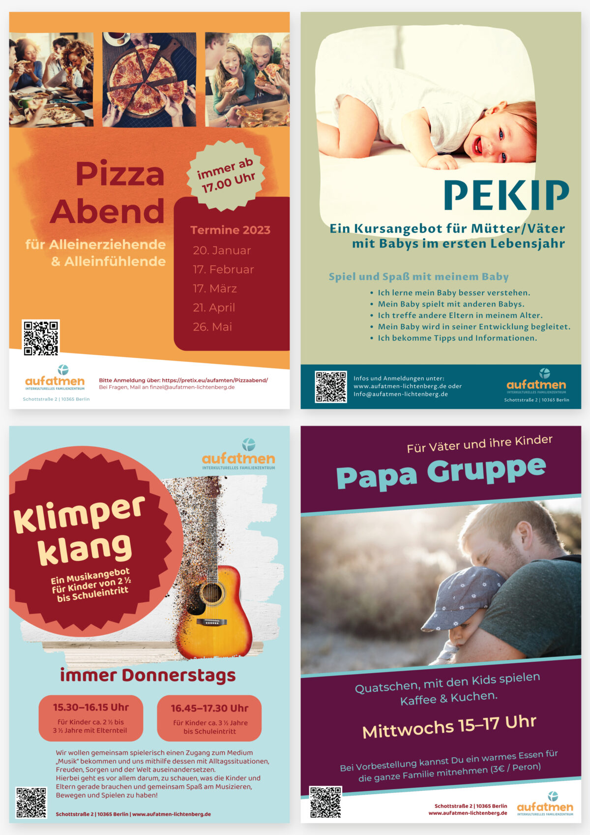
Diese drei Farben wurden durch eine zweite Farbpalette mit ebenfalls warmen Tönen ergänzt, um eine breite farbliche Varianz für Werbematerialien und Social Media Posts zu haben.
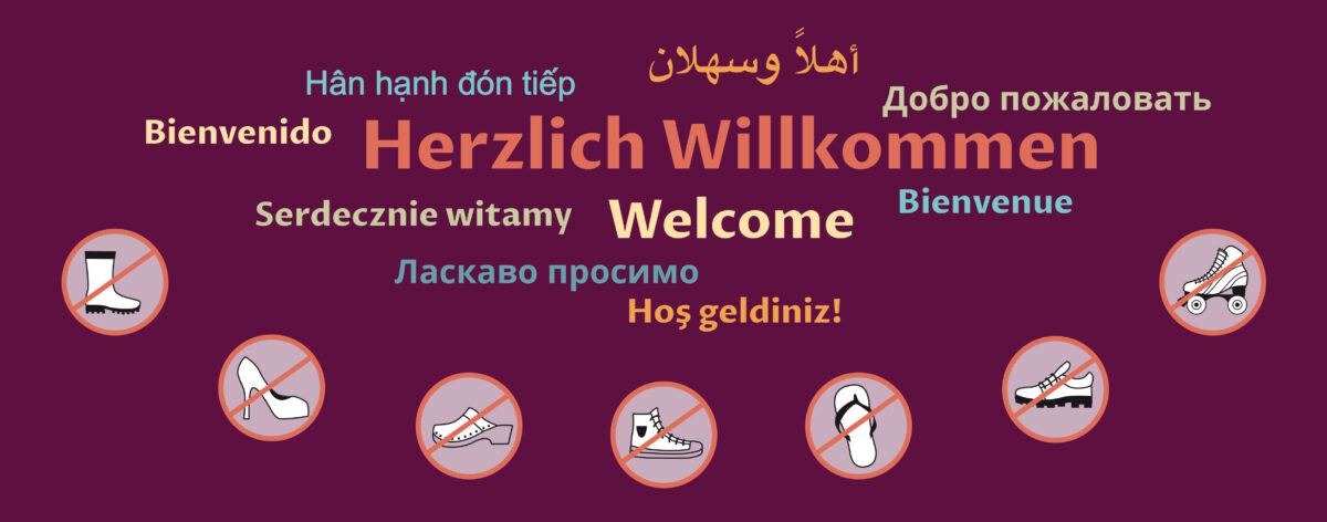
Neben dem Logo konnte das grafikbuero ein kleines Corporate Design in Form von Briefpapier, Visitenkarte, einem Banner für die Außenwand des Cafés und einen Bodenaufkleber mit der piktografischen Aufforderung, die Schuhe auszuziehen, gestalten.
https://www.aufatmen-lichtenberg.de
The intercultural family centre “aufatmen” commissioned grafikbuero to redesign its logo. The logo includes the signet of the ora Kinderhilfe e.V. sponsoring organisation and two lettering elements with the name and subtitle. These elements were to be retained.
The colours of the new logo were to be friendly, warm and light and match the red and blue of ora Kinderhilfe.
The chosen dark yellow and muted to light turquoise create a warm, cosy base on the one hand and at the same time a certain expansiveness that allows people to breathe a sigh of relief.
These three colours were complemented by a second colour palette with equally warm tones to create a wide range of colours for advertising materials and social media posts.
In addition to the logo, grafikbuero was able to create a small corporate design in the form of stationery, business cards, a banner for the outside wall of the café and a floor sticker with a pictographic invitation to take off your shoes.